Ideation and Planning
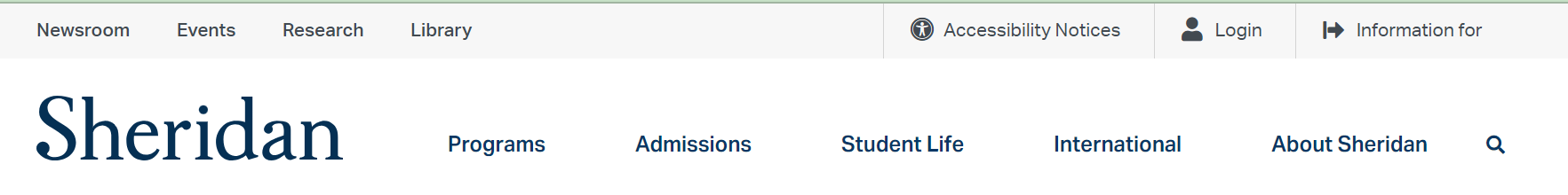
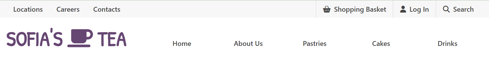
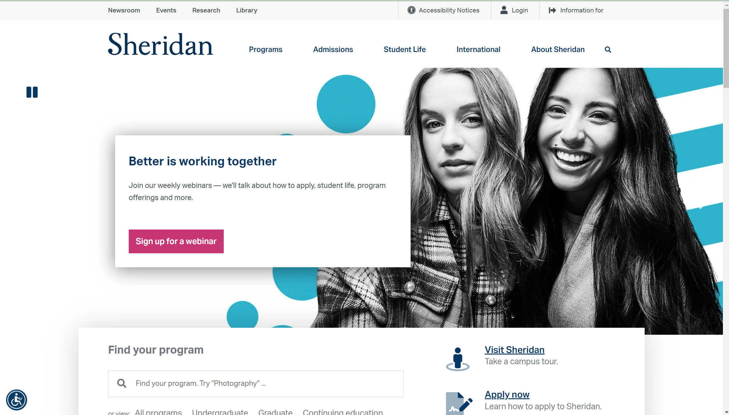
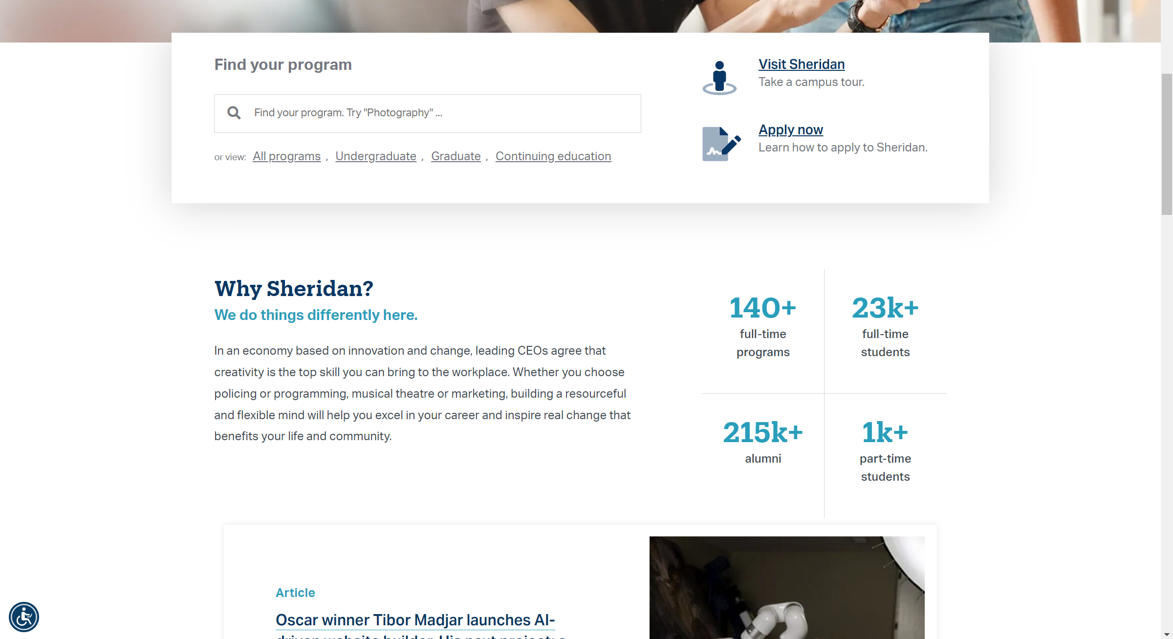
The idea behind this website was simple, one of my friends dreams was to open up a bakery with her sister. This gave me the idea of basing the website off of this business idea. Of course the business does not actually exist which is why the photographies were hard to obtain so I had to rely on a few images from the web which are free for public use. I chose the Sheridan website as an inspiration because I was very fascinated by its simple but elegant design. Its home page did not feature any unnecessary content making it easy to feature all of its structure without cutting out any sections.
I began this project by deciding a color palette. I used an online palette maker to help me choose but also looked at other bakery sites to draw some inspiration. One of the sites I was most drawn by is the company Cobbs Bread. Their primary color is a wine red and they dont really use any other color, instead they use different shades of their primary color making it a very aesthetic site. I finally landed on using purple as the main color of this project and defined it as a function in the root of the CSS.
I then decided what content I wanted to feature to replace the numerous links the Sheridan site offers. In most bakery sites I lookd at, they have no more than 5 links (including the home page link) in their global navigation bar and they did not feature any utility navigation bars. This made it harder for me to come up with enough links to match Sheridans page. However, I used some of the links some bakery sites had on the footer and palced them in the same palce as the Sheridan site in the header section.
Developing the Navigation Bar
The Sheridan site features a very simple design, they have a utility bar at the top of the page with a grey background and two sets of links: One of the sets of links features horizontal border lines while the others dont. I replicated this effect using display: flex and spacing out the two sets of links with justify-content: space-between then adding the borders to the links on the right side of the screen. The following taks I had to accomplish was the global nav. section. To design this part of the website I first needed the logo for the bakery which I created simply by using an h1 tag and using an icon to compliment the logo. Next to it, I used an unordered list and distributed the elements evenly by using a display: grid property and setting each column in the grid to even width.
The last thing I had to replicate was the hover effect in the sheridan site. When you hover on one of the elements in the global nav, the block arund the element gets a shadow making it stand out over the other elements. In addition, the element gets a blue border on the top of aroudn 4 pixels. To replicate this element I used an inset shadow effect rather than a border because the border would alternate the padding of the elements, while adding a shadow with no blur perfeclty mimicked the original site.
Home Page
The home page starts with a carousel of images and featured content at the very top of the page. unfortunately I could not manage to make my carousel functional with javascript. Instead I simply added the image and feature content as well as the arrows to mimic those of a working carousel of pictures. The content in the carousel is displayed in a white box just like in the Sheridan page and has a header of the primary color of the site and a button. I layed out this block of content and positioned it as accurately as possible with position: relative and the top & left stylings; the arrows were displayed with an absolute position.
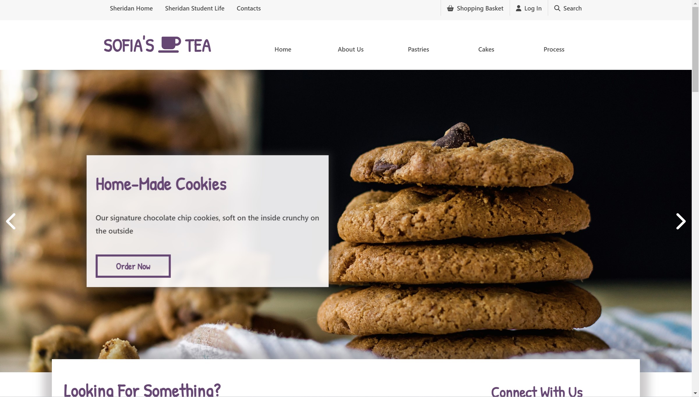
Under the carousel is a block of content with a search bar which slightly overlaps the images in the carousel. The block in the original Sheridan page has two separate icons. I replicated the overlapping effect using a transform: translate propety and implemented the search box with some featured content under it. Where I decided to drift awat from the design is in the right end of the block. Instead of using two sections with headings and sub-headings, I figured this could be used for a social media section. It is important for all businesses to have easily accessible social media and having other content in this area would have hindered the importance of the social media pages that are referred. Ultimately, this changed the layout but kept a similar aesthetic while allowing me to implement a key section of the site.
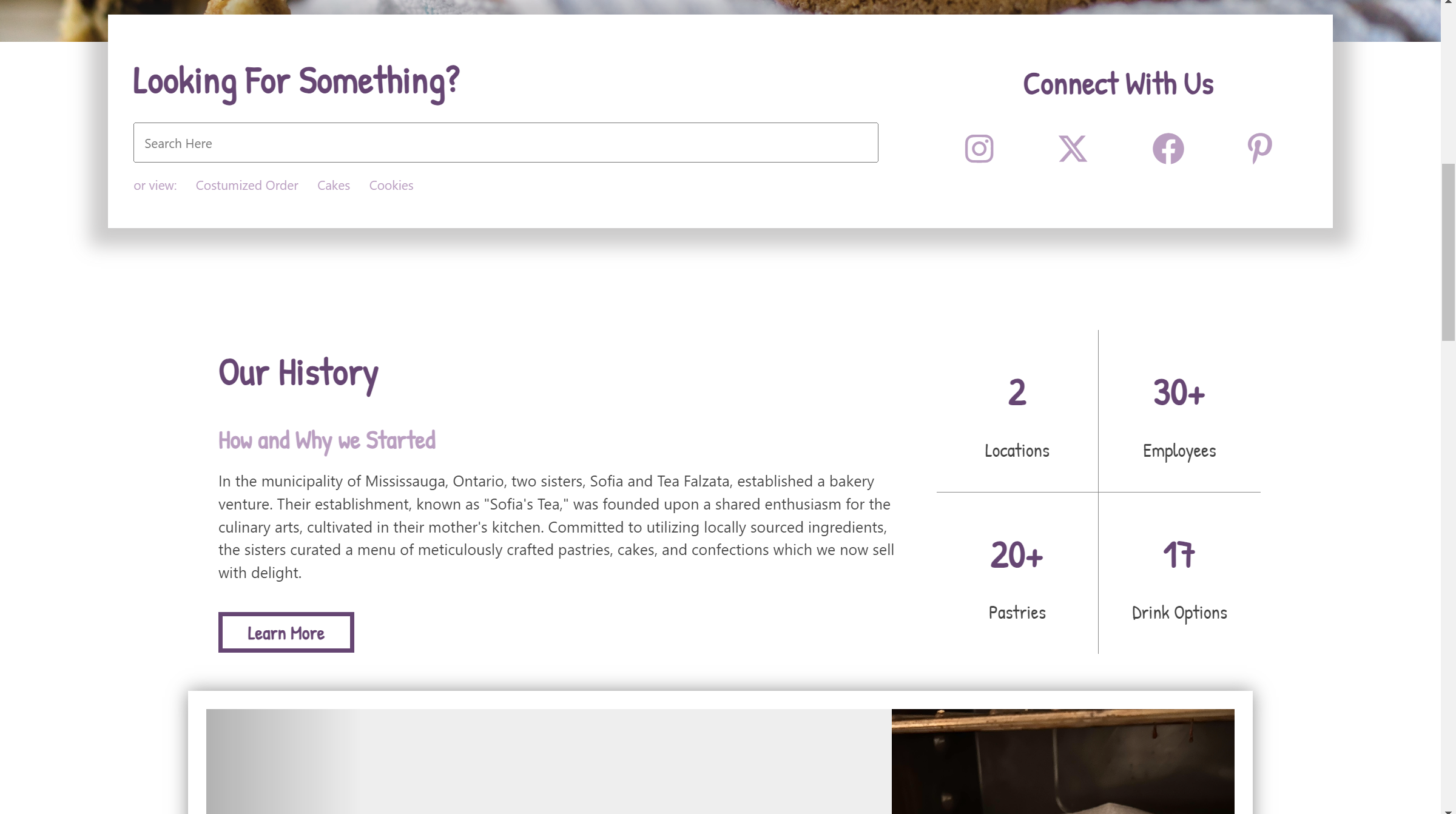
Following this section of the page, I designed a segment that featured a paragraph with information on the right side and a content grid on the left with borders forming a cross in between the text. The paragraph section of the page was fairly easy to develop, however the grid was a little tricky. To do the list I made a section with 4 divisions each with an h2 and h3 tag. I once again used the display grid and a property of grid-template-column: 50% 50%; This made 4 columns of eaqual width and to make them a square I finally added an aspect-ratio: 1; making each division a perfect square. Finally, to add the border lines that separate each set of information I used a nth child property which allowed me to select specific squares, giving the odd number childs (1 & 3) on the left a border right. This added the vertical line and the horizontal line was displayed by selecting the bottom children (3 & 4) and giving them a border-top. The result looked accurate and it was a perfect feature to highlight some interesting facts about the bakery.
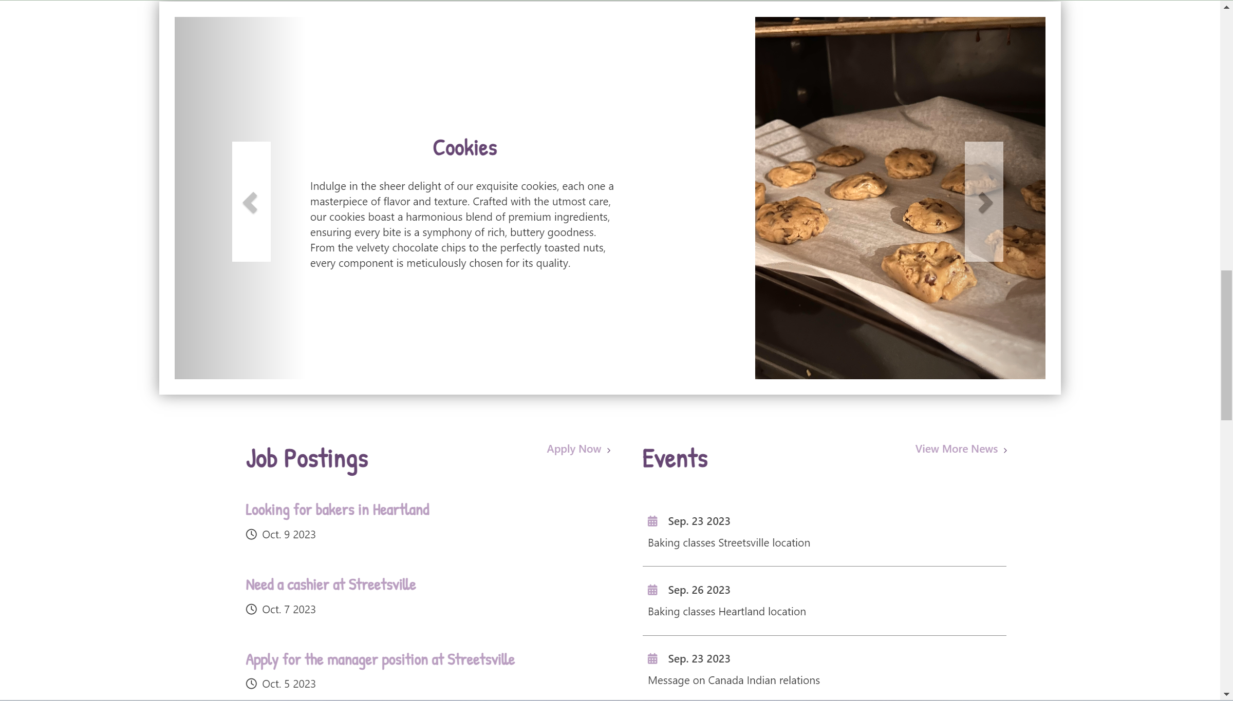
The next section was a carousel that featured a large segment of text and a denotative image. For this I actually bootstrapped the a carousel from w3schools from this link https://www.w3schools.com/bootstrap/bootstrap_carousel.aspThis gave me the JavaScript I needed to make the carousel functional and I simply had to add some additional styling by locating the elements with the inspect tool and styling my elements there and later pasting the adjustments made to my code. There are certain features however that I had to style directly in my html to overwrite the bootstrap. For example, adding the padding to the carousel to copy the one in the Sheridan page or add a shadow to the element. There were a few things that I failed to copy from the carousel in the original page like the location of the arrows, which are originally on the outside of the carousel. However, I tried my best to replicate the effect by making the arrows grey with a semi-transparent white backgroud.
After the second carousel was an events/calendar section in the Sheridan site. I replicated this section using flexbox and grid. The right side was a challenge to get right since there was borders on the bottom of the elements. However using grid I was able to evenly space out all the elements and add the border to the bottom of each parent.
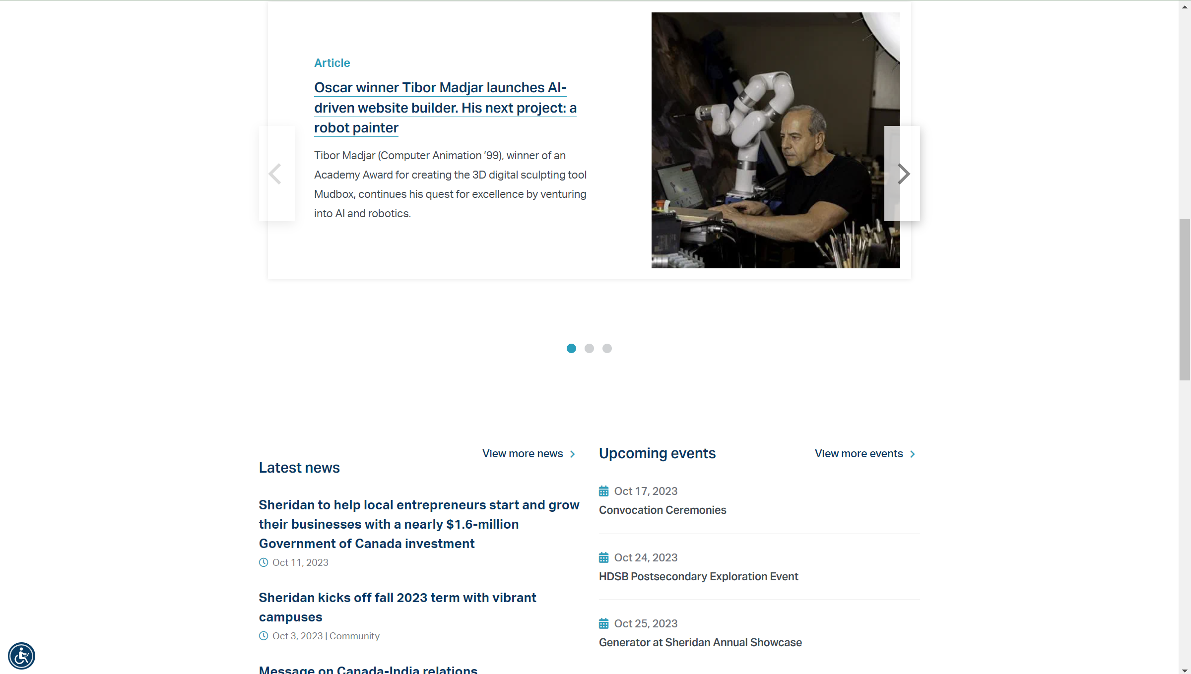
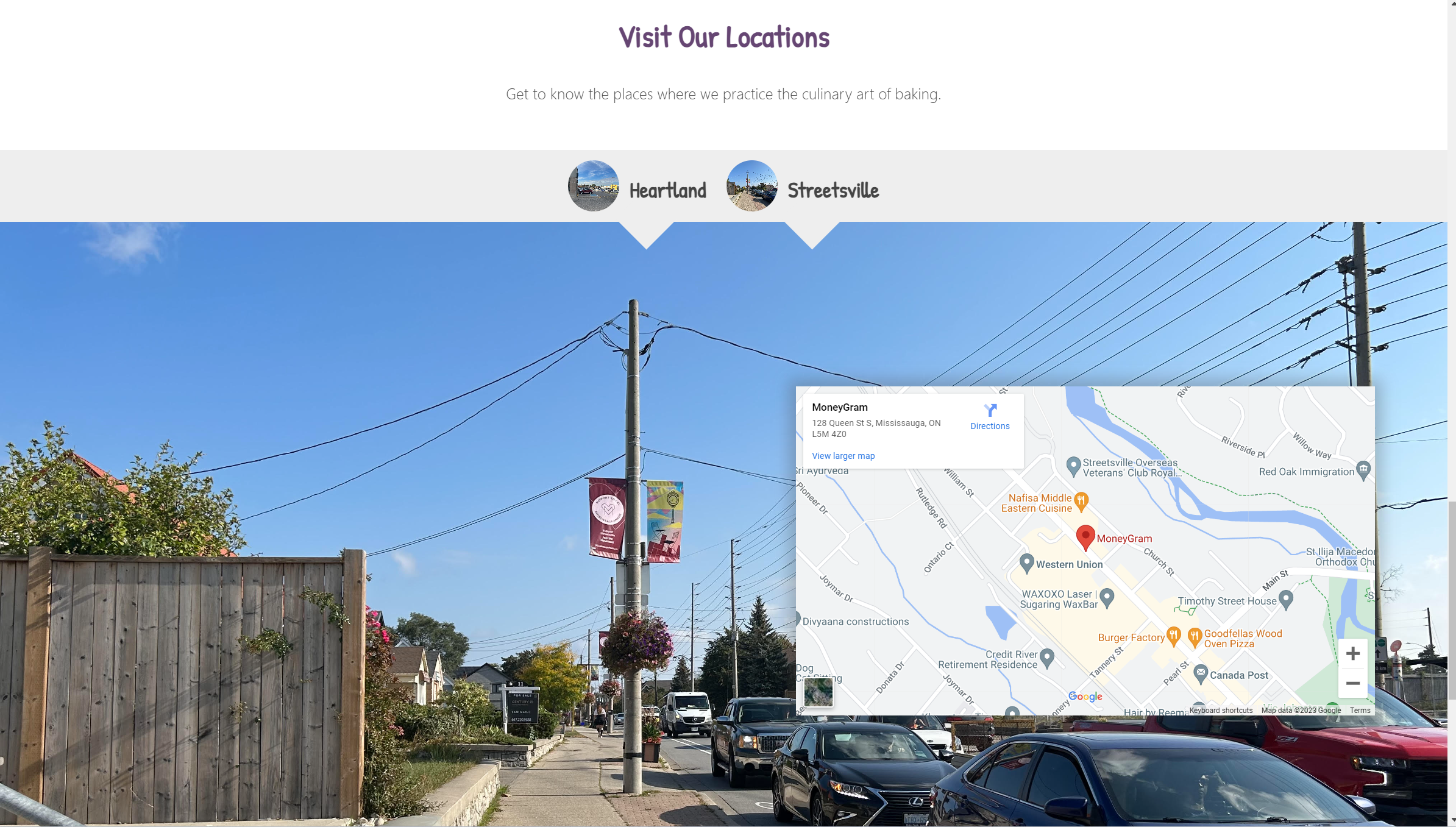
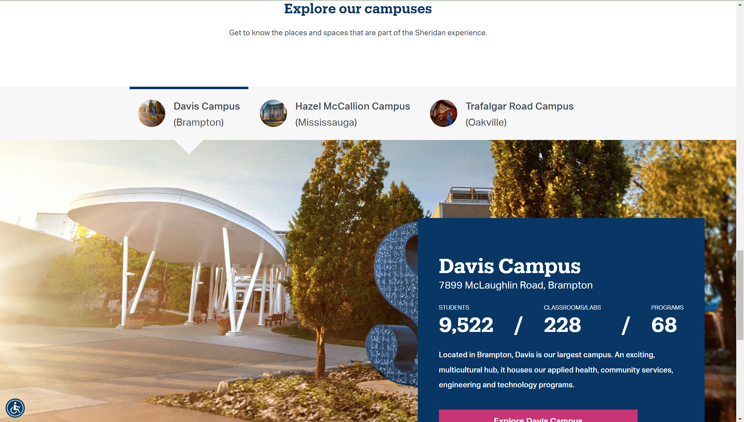
Finally, the Sheridan page had a version of a carousel at the bottom of the page above the footer where they displayed images and facts about their campus. The design was easy to replicate but making it functional was quite challenging. I used querySelectors in JavaScript to define each element and later added eventListeners to make the zindex of the overlapping images change when the location buttons were changed. I was not able to make the arrow effect happen on command. I was able to design it as a static element using the ::before property and making a shape. Finally the top border appearing on hover was done the same way as the navgation, using an inset shadow on the top of the element.
About Us Page
The about us page in Sofias Tea was based on the Student Life page in Sheridan College. This was, like the home page, a very simple but effective design. It gave opportunity to feature a lot of content but did not overwhelm me as a viewer. It also used many images so it gave me a chance to use some of the media I produced myself.
The first section was simply an connotative image of the screens width which was very easy to place. Then, there was a writing section of around 70% of the page where the entirety of the content fit. This area also overlapped the connoctative image which again was done using a transform: trasnlate(); property.
The next element I focused on was the arrangement of the page. The top was easy to replicate as it was a heading followed by a brief paragraph. Under this section was a 3 column design, each column featuring an image, a heading with an arrow and a paragraph elaborating information suggested by the heading. I used a display grid to develop the three columns and then spaced out the content in eahc column using flexbox.
Finally, I had to make the rest of the about us page which was actually simple since the content all followed a 2 column structure. Each column occipuied around half of the section minus the gap in between. They all have an image header and paragraph except for one of the sections. Nonetheless, this didnt change much as I ended up using the same strategy as before of organizing the divisions using a grid and later the content of the divisions using a display: flex;
Footer
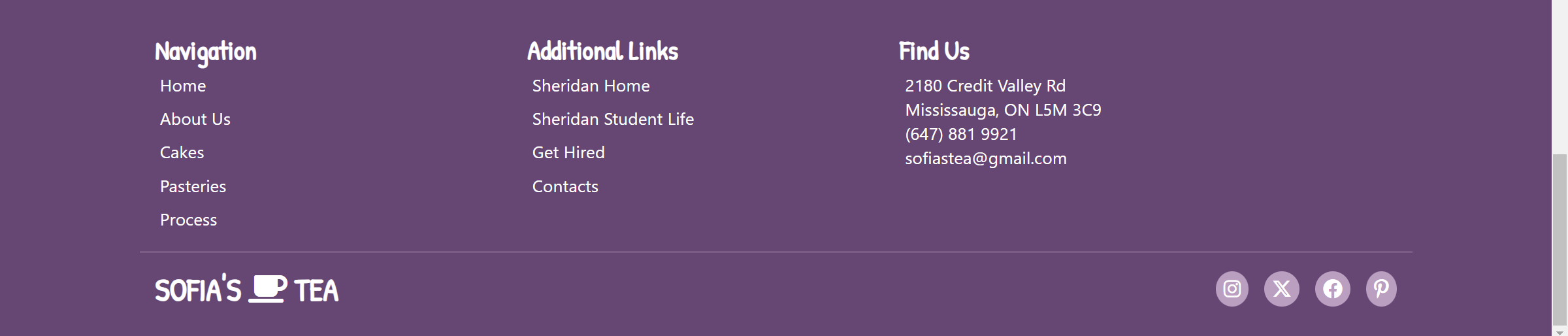
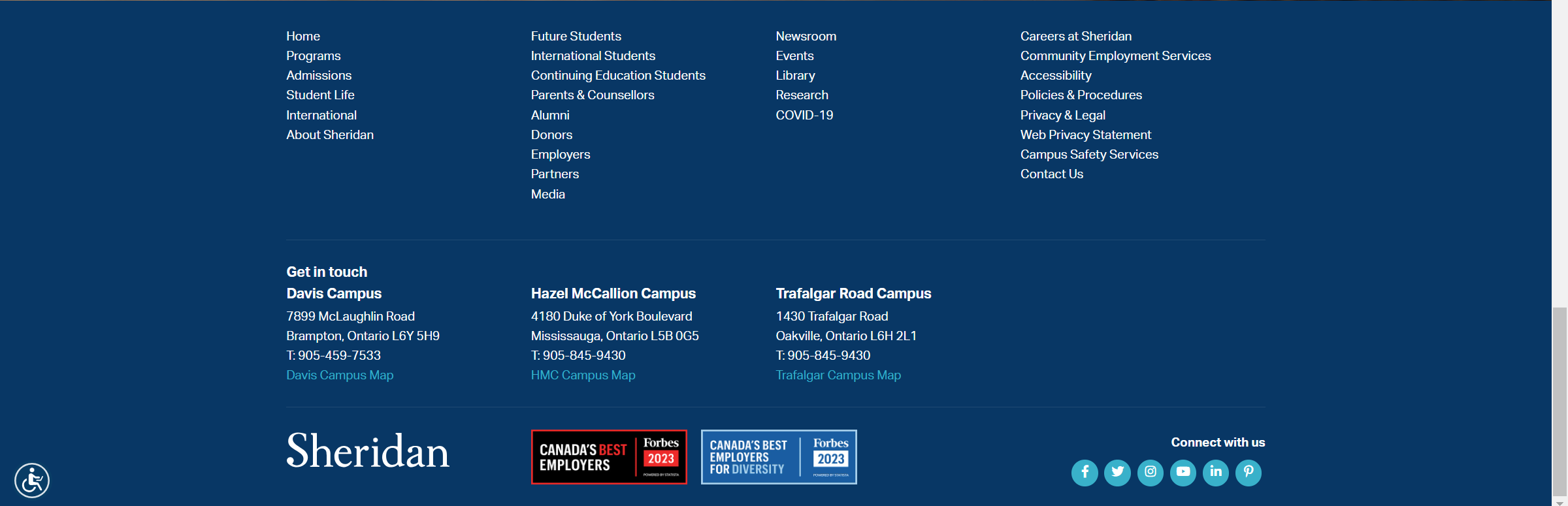
One of the things I immediately noticed as I was seeing Sheridan's footer was that it was also filled with numerous links most of which I didnt require for this project. Before getting to ideating how I would adapt the structure to my site I looked again at the footers of other bakeries and found again that the majority of them did not feature many links outside of social media and the links used in the navigation bar. The Sheridan footer was divided in 3 rows, a row featuring numerous links to additional content, a section with the addresses and contact information of the different campuses, and a third section with the logo and some social media links. I decided that I could remove one of the rows and fit all the content I needed in two sections. I used a ul to create the columsn of content in the rows and fit the links in li tags. I used flexbox to space out the columns and the last thing I needed to add was the border at the bottom of the section to mark the division of the content.
For the bottom half I simply used an h1 tag to create the logo once again and another unordered list to make the media tags. Finally, I used a display: flex; and justify-content: space-between; to space out the elements. The last detail I had to take care of was the media styling. The Sheridan page featured their social media pages in blue cricles with white logos, so I did the same with a brighter purple to follow the color scheme of the rest of the site.
Obstacles and Improvements
The development of the site was, for the most part, very smooth sailing. However, something I was troublesome and I was not able to fix was the bootstrap changing some of the styling elements of the site. When I implemented the bootstrap for the carousel it adjusted the padding and font size of the headings and text areas of the page. This slighltly altered the design as (the changes can be seen in the navigation bar when you change from the home page to the about us or process page). It was hard to overwrite the changes, some of the fixes I had to add individually in each segment of the page. For example, the bootstrap file altered the weight of the heading font. If I were to re-do this project I would like to find a way to cancel these changes
Another difficulty I faced was finding images and taking new media production. This is beacause it is not a real business so I couldn't take pictures of the employees for example, or the products. I had to undertake the task of baking myself for some of the images or used pictures of some of the events I have attended. For some images however, like the ones of employees, I had to aquire them from the internet. They are all free licensable images so there is no copyright issues and all sources are cited below.
Sources Used
https://www.sheridancollege.ca/
Bakery Background Image (About Us)
People In Bakery Image (About Us)